The ultimate guide to designing an eye-catching exhibition stand: captivate your target audience!
21 February 2024The importance of an eye-catching exhibition stand
Creating an eye-catching exhibition stand is crucial to captivate your target audience. First, it attracts the attention of your target audience. In a sea of booths, you want yours to stand out and attract people. An eye-catching design will spark curiosity and encourage visitors to stop and learn more about your brand and offerings.
In addition, an eye-catching exhibition stand helps establish your brand identity and create a memorable experience for your visitors. When done right, it can leave a lasting impression and make your brand more recognizable in the future. A well-designed booth can also improve your credibility and professionalism, showing potential customers that you take your business seriously.
Understand your target audience
Before you start designing your exhibition stand, it is essential to have a thorough understanding of your target audience. Who are they? What are their interests, weaknesses and goals? By answering these questions, you can create a booth that resonates with your target audience and captures their attention.
Start by thoroughly researching your target market. Examine demographic, psychographic and behavioural characteristics. Collect data from customer surveys, social media insights and industry reports. All this information will help you create a buyer persona that represents your ideal customer.

Plan the layout and design of your exhibition stand
Now that you have a solid understanding of your target audience, it’s time to plan the layout and design of your exhibition stand. A well thought-out layout will ensure smooth circulation and maximize the use of space.
Here are some key factors to consider:
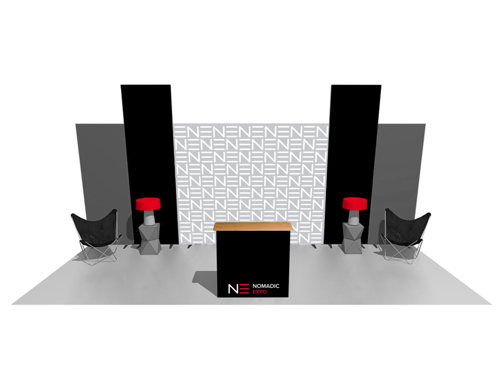
1. Traffic: Analyze the location and identify the most common traffic patterns. Place your stand in a busy area, for example near the entrance or between popular attractions. This will increase the chances that visitors will notice your booth and enter.
2. Open and inviting: Create an open and welcoming space that encourages visitors to enter. Avoid barriers or closed areas that make people feel unwanted. Instead, use open sides or transparent walls to make your cabin accessible and accessible.
3. Interaction zones: Divide your booth into different areas, each with a specific purpose. For example, you can have a demo area, a networking lounge, and a product display area. Clearly define these areas using different flooring, lighting or signage to guide visitors through your stand.
By carefully planning the layout and design of your exhibition stand, you can ensure a seamless experience for your visitors and maximize the impact of your stand.
Choose the right colors and brand elements
Colours play a crucial role in creating an eye-catching exhibition stand. They evoke emotions, convey messages and can make your stand more memorable. When choosing the colours of your display stand, keep the following tips in mind:
1. Consistency with the brand image: Use colors that match your brand identity. Your exhibition stand should be an extension of your brand, so make sure the colors you choose are consistent with your logo, website and other marketing materials.
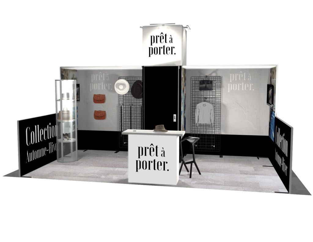
2. Contrast and Visibility: Opt for high contrast colors to ensure remote visibility. This will help your stand stand out in a crowded showroom.
3. Colour psychology: Consider the psychological impact of different colours. For example, blue is often associated with confidence and reliability, while red can evoke excitement and energy. Choose colors that match your brand personality and the emotions you want to evoke in your target audience.
In addition to colors, incorporate other brand elements such as logos, slogans and slogans into the design of your exhibition stand. These elements should be prominent and easily recognizable to reinforce your brand identity.
Add interactive elements
To create an immersive and engaging experience for your visitors, consider incorporating interactive elements and technology into your exhibit booth design.
This may include:
1. Touch screens and digital screens: Use touch or digital screens to present product demonstrations, videos or interactive content, such as PanoLED or free-standing iPad stands. This allows visitors to interact more deeply with your brand and learn more about your products or services.
2. Virtual Reality (VR) or Augmented Reality (AR): If so, consider using VR or AR to provide a unique and interactive experience. This technology can transport visitors to a different world or allow them to view your products in their own environment.
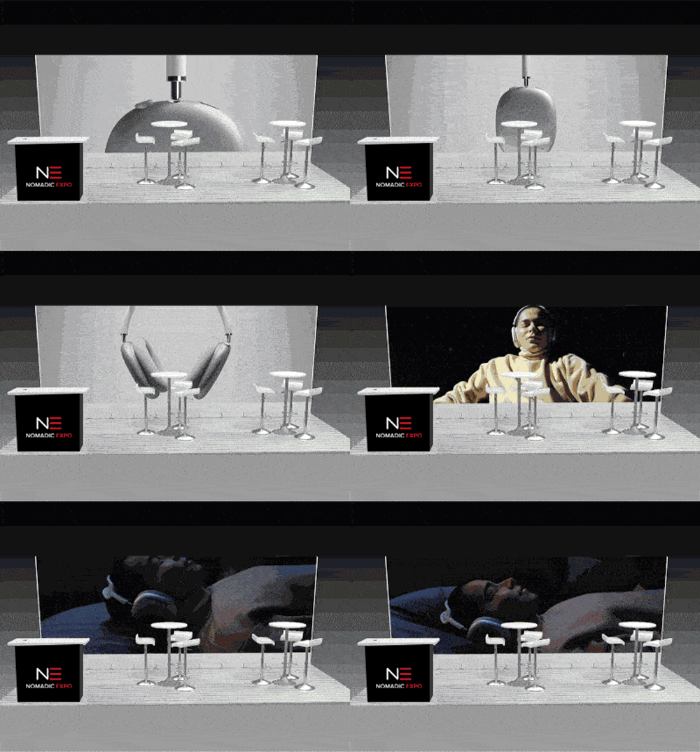
3. Interactive activities : Include games or interactive activities at your booth to encourage visitor participation. It can be as simple as a prize wheel or a digital game that educates visitors about your brand while entertaining them.
By integrating interactive elements and technology, you can create a memorable and engaging experience that sets your booth apart from the competition.
Use of compelling visuals and graphics
Visuals and graphics are powerful tools to capture attention and convey your brand message. Here are some tips for using engaging visuals in your booth:
1. High quality images: Use high-resolution images that present your products or services in their best light. Invest in professional photography or graphic design to ensure your visuals are visually appealing and accurately represent your brand.
2. Large scale graphics: Use large-scale graphics and banners to create impact and attract attention. These visuals must be visually impactful and effectively communicate your brand message.
3. Typography: Choose fonts that are easy to read remotely and that match your brand identity. Avoid using too many different fonts, as this can make your booth cluttered and confusing.
Remember that the visuals should complement the overall design of your stand and support your brand’s narrative. Keep them consistent with your brand elements and use them strategically to capture attention and effectively convey your brand message.
Integrate narration and messages
Storytelling is a powerful marketing tool that can help you connect with your target audience emotionally. By incorporating storytelling into the design of your exhibition stand, you can create a story that engages visitors and leaves a lasting impression. Here’s how you can do it:
1. Brand Story : Create a compelling brand story that reflects your mission, values and unique sales proposition. Use this story as the basis for the design and message of your exhibition stand.
2. Engaging text: Write concise and engaging text that effectively communicates your brand message. Use catchy headlines, bullets, and calls to action to grab visitors’ attention and encourage them to learn more about your brand.
3. Interactive narration: Consider using interactive elements, such as touch screens or videos, to tell your brand story in a more engaging and immersive way. This can create a memorable experience for your visitors and bring out your stand.
By integrating storytelling and messaging into your booth design, you can create an emotional connection with your target audience and differentiate yourself from the competition.
Captivate your target audience by creating a flow
Even if you have limited space, you can still create an eye-catching exhibition stand that maximizes the use of every square inch. Here are some tips for maximizing space and creating a flow:
1. Vertical space: Use vertical space by incorporating tall structures, hanging banners or suspended elements. This draws the eye up and makes your cabin bigger and more visually attractive.
2. Modular Design: Consider using modular display components that can be easily reconfigured to accommodate different booth sizes and configurations. This allows you to adapt to different exhibition spaces without sacrificing the visual impact of your stand.
3. Furniture and accessories: Choose furniture and accessories of the appropriate size for your booth. Avoid overloading the space with too many pieces, as this can make your stand cluttered and unattractive. Opt for functional rooms that enhance the overall design and provide a comfortable experience for visitors.
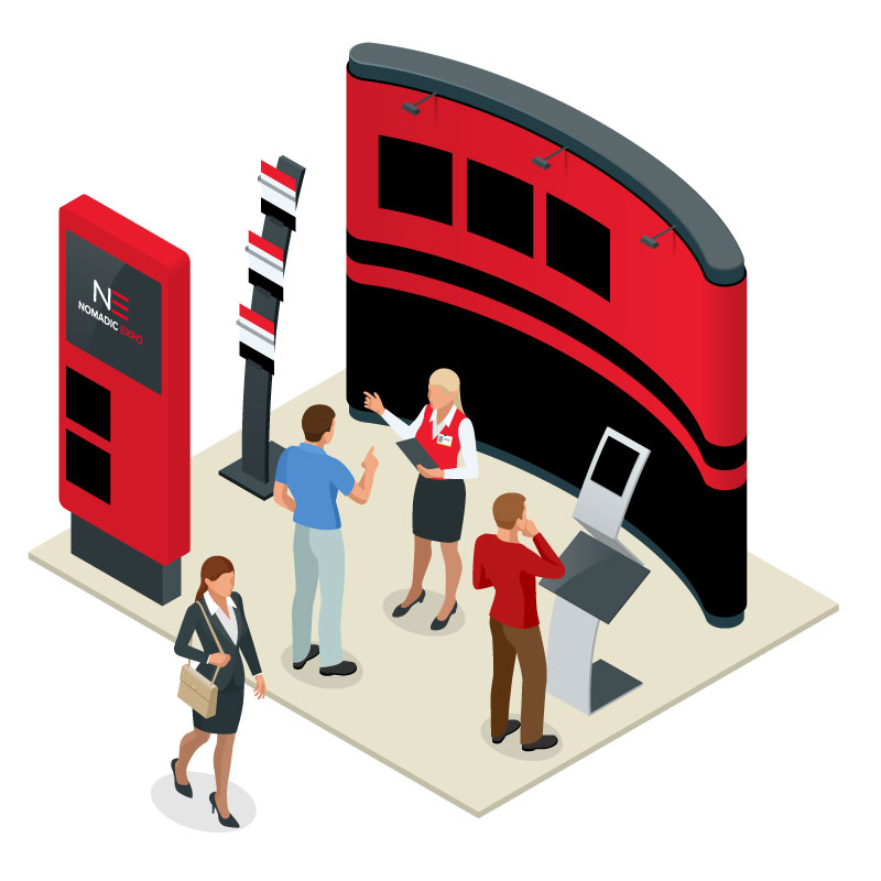
It is also essential to create a feed within your booth so that visitors can easily navigate and interact with different areas. Use clear signage, flooring or lighting to guide visitors through your booth and create a logical path.
Test and optimize the design of your exhibition stand
Once you have designed your exhibition stand, it is essential to test and optimize it before the event. Here are some steps you can take:
1. Simulated exhibits: Set up your exhibit booth in a simulated exhibit space to get an idea of its appearance and operation in a real-world context. This allows you to identify design flaws or areas for improvement.
2. Colleague and Peer Feedback: Seek feedback from your colleagues or industry peers. They can provide valuable ideas and suggestions for improvement.
3. Pre-event surveys: Send surveys to attendees or potential customers to gather feedback on your booth design. This can help you identify any areas that may need further adjustments or optimization.
By testing and optimizing the design of your exhibition stand, you can ensure that it is visually appealing, functional and aligned with your goals and target audience.
In conclusion: Captivate your target audience with an eye-catching exhibition stand
Designing an eye-catching exhibition stand is a strategic process that requires careful planning, understanding of your target audience and attention to detail. By following the steps outlined in this ultimate guide, you can create a booth that demands attention, captivates your target audience and leaves a lasting impression.
Remember to consider the importance of an eye-catching exhibition stand, understand your target audience, plan the layout and design of your stand, choose the right colors and brand elements, to integrate interactive and technological elements, to use captivating visuals and graphics, to integrate narration and messaging, to maximize space and create a flow, and finally, to test and optimize the design of your exhibition stand.
Don’t settle for a mediocre cab that fades in the background. With the ideas and tips provided in this guide, you have the tools to design an eye-catching exhibition stand that will captivate your target audience and set you apart from the competition. Start implementing these strategies today and watch your booth shine at your next event!
OUR UNIQUE 360° EXPERIENCE IS WHAT SETS US APART FROM COMPETITORS!
Get in touch with one of our project managers. You’ll understand what we mean by EXPERIENCE 360°.
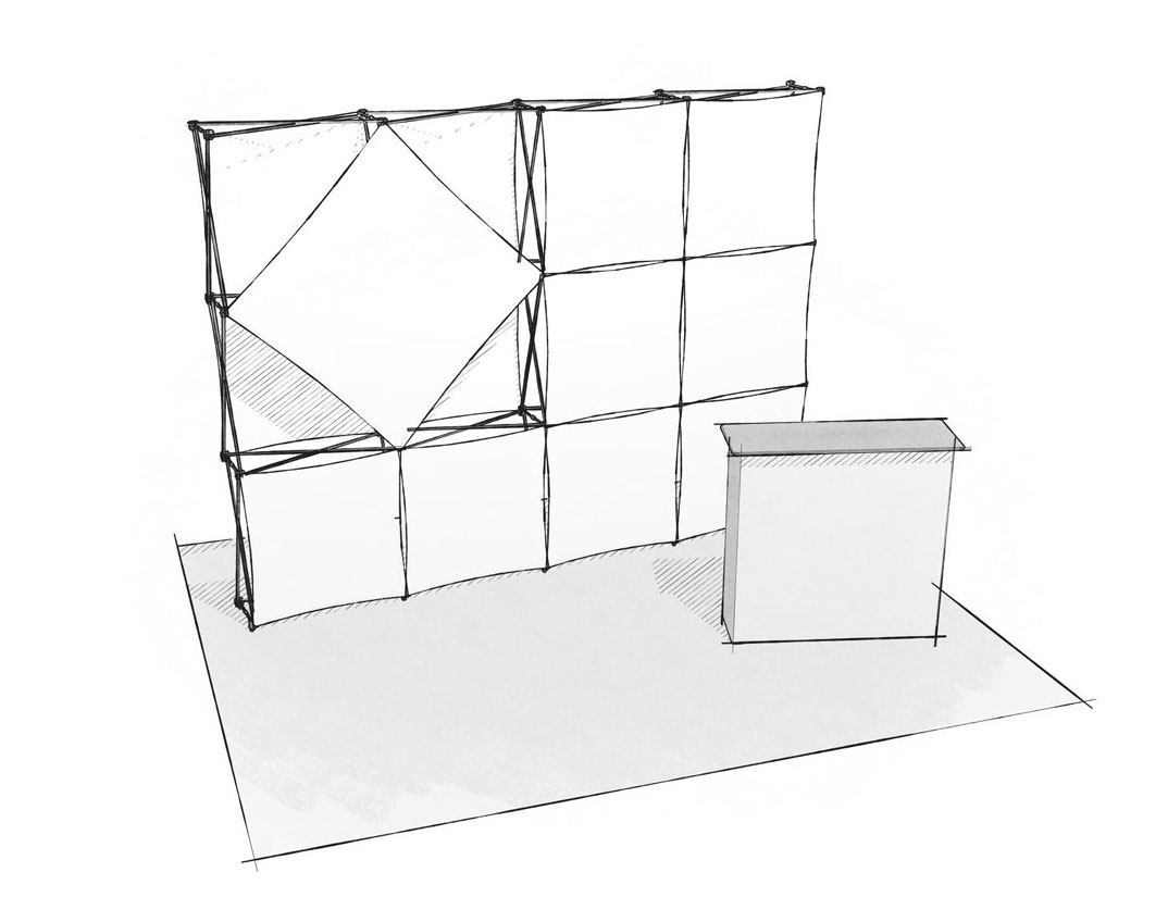 Portable Kiosks
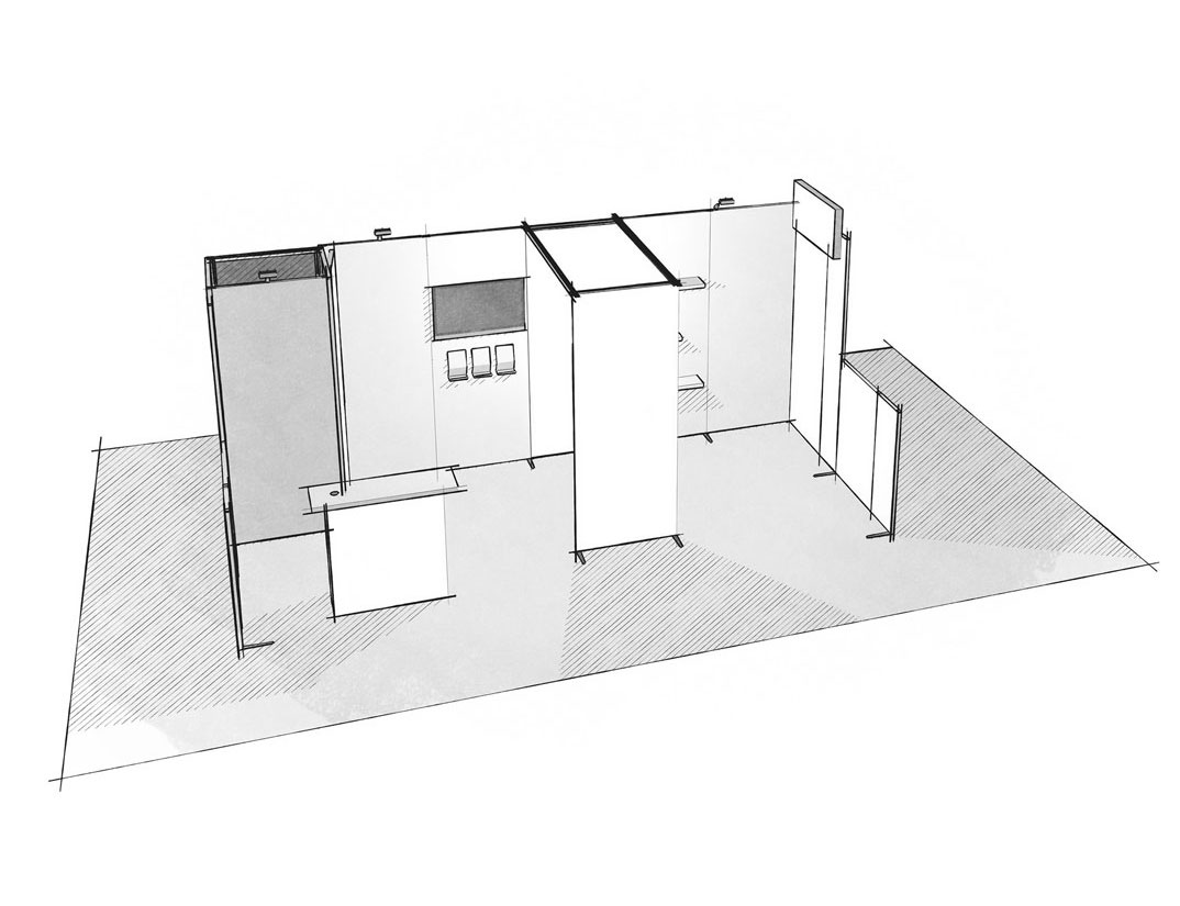 Custom kiosks
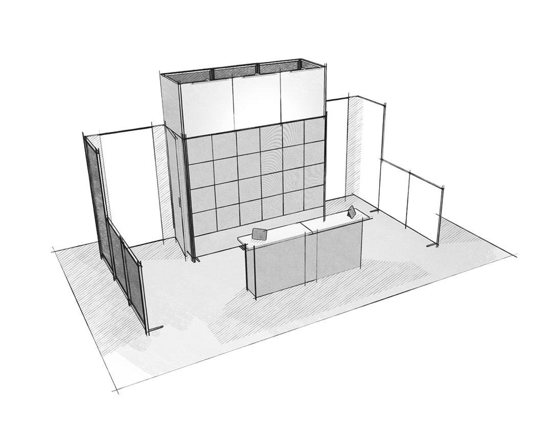 Backlit products and PanoLED video wall
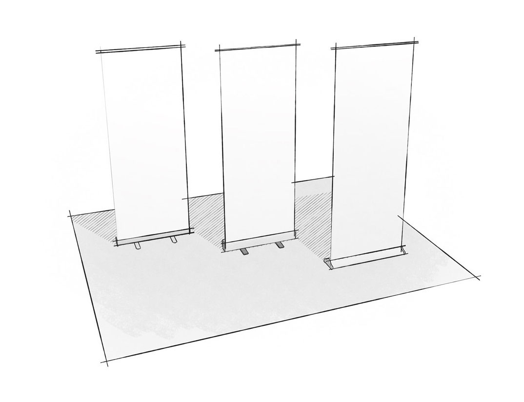 Retractable Banners
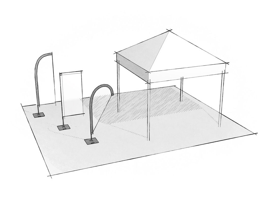 Outdoor products
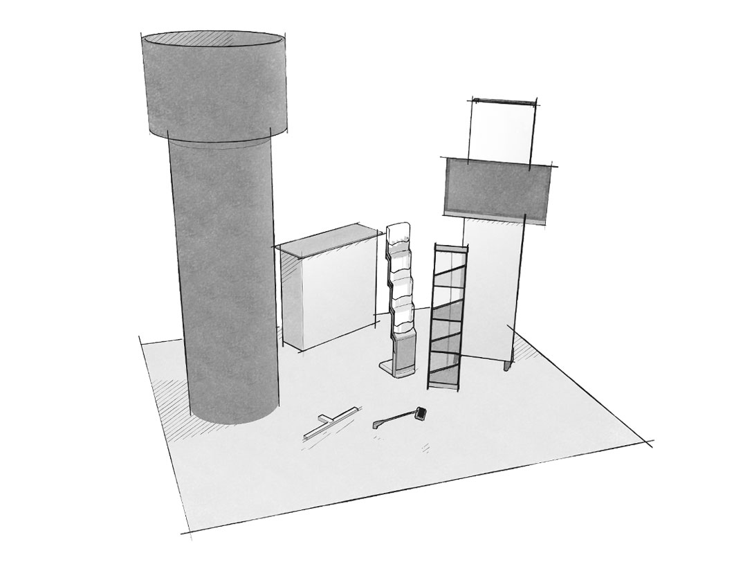 Portable counters, towers and accessories